Client Success Stories
Client Success Stories
Client Success Stories

Aamchi Vadapav
Logoclub99 transformed a local Vadapav business into a memorable Mumbai street-food brand through strategic naming, mascot creation, and a scalable brand identity that now powers growth across multiple locations
Before Logoclub99
After Logoclub99
No brand identity
Memorable brand identity
No creative direction
Playful mascot & packaging
No memorable customer experience
Scalable brand across 7 outlets
Aamchi Vadapav
Logoclub99 transformed a local Vadapav business into a memorable Mumbai street-food brand through strategic naming, mascot creation, and a scalable brand identity that now powers growth across multiple locations
Before Logoclub99
No brand identity
No creative direction
No memorable customer experience
After Logoclub99
Memorable brand identity
Playful mascot & packaging
Scalable brand across 7 outlets

Kebshack
Built a bold Middle Eastern-inspired brand identity that transforms a new restaurant into a memorable and scalable street food experience.
Before Logoclub99
No distinct brand identity
Generic market presence
Limited brand recognition
After Logoclub99
Bold Middle Eastern identity
Premium visual system
Built for scalable growth
Kebshack
Built a bold Middle Eastern-inspired brand identity that transforms a new restaurant into a memorable and scalable street food experience.
Before Logoclub99
After Logoclub99
No distinct brand identity
Bold Middle Eastern identity
Generic market presence
Premium visual system
Limited brand recognition
Built for scalable growth
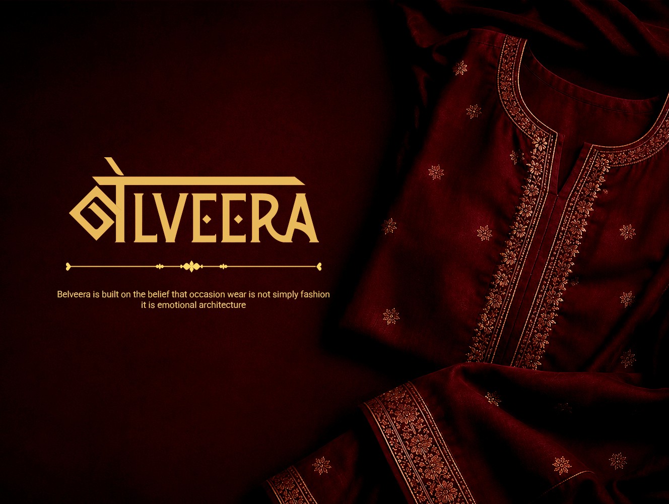
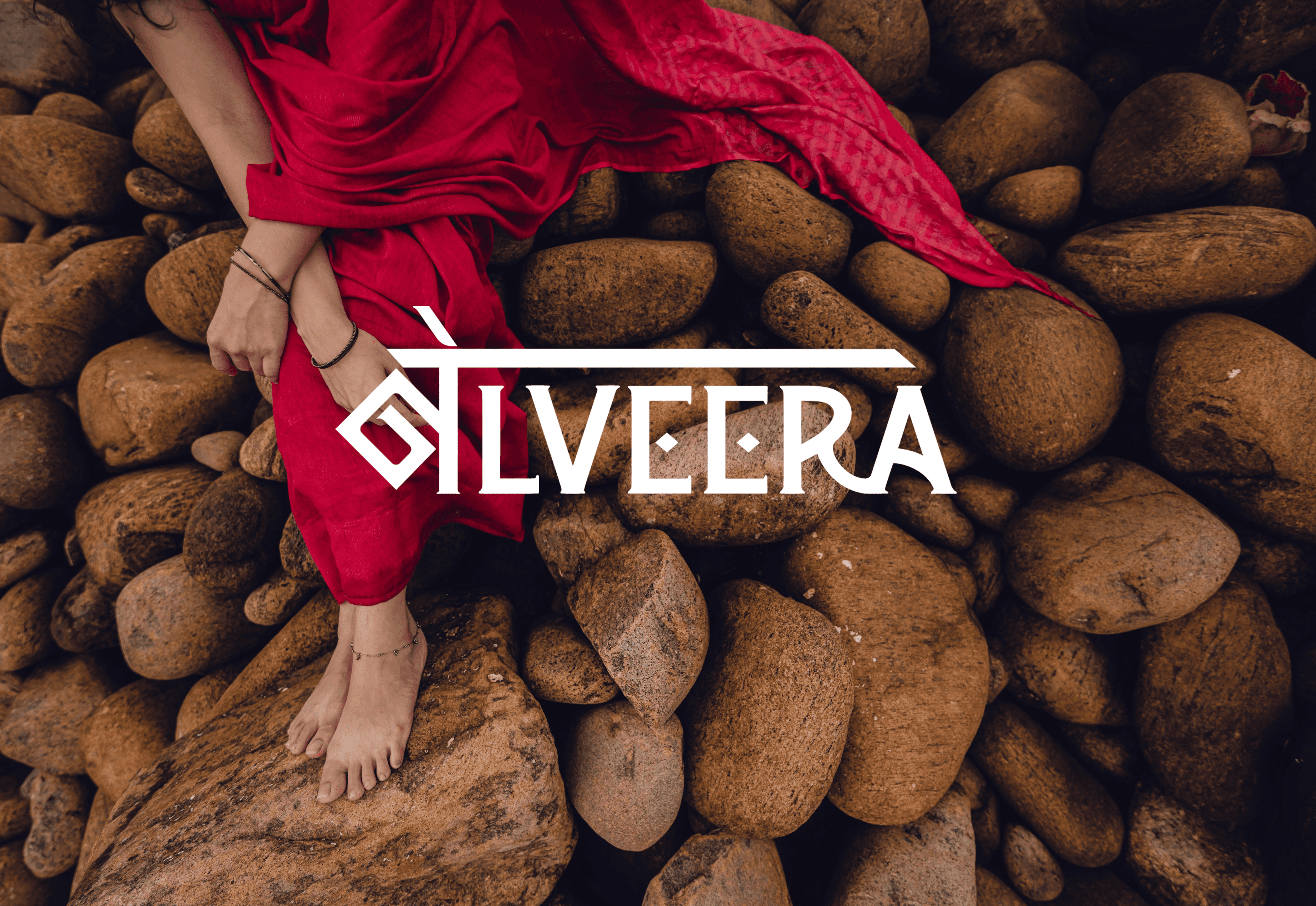
Belveera
We created a feminine visual identity rooted in Indian heritage, with a custom logo featuring the Hindi letter 'ब' (Ba) to reflect Belveera's Indian roots.
Before Logoclub99
No brand identity
Incorporated relevant visuals/textures.
Limited brand recognition
After Logoclub99
Rooted Indian identity
Visuals lacked essence
Cohesive visual system
Belveera
We created a feminine visual identity rooted in Indian heritage, with a custom logo featuring the Hindi letter 'ब' (Ba) to reflect Belveera's Indian roots.
Before Logoclub99
After Logoclub99
No brand identity
Rooted Indian identity
Incorporated relevant visuals/textures.
Visuals lacked essence
Limited brand recognition
Cohesive visual system